If you’ve noticed KIA’s new TV ads lately, or seen their vehicles around town you might have picked up on their new logo. Yes, it’s that one you can’t quite figure out.
Apparently the brand has stated that the new logo embodies “symmetry,” “rhythm” and “rising.”
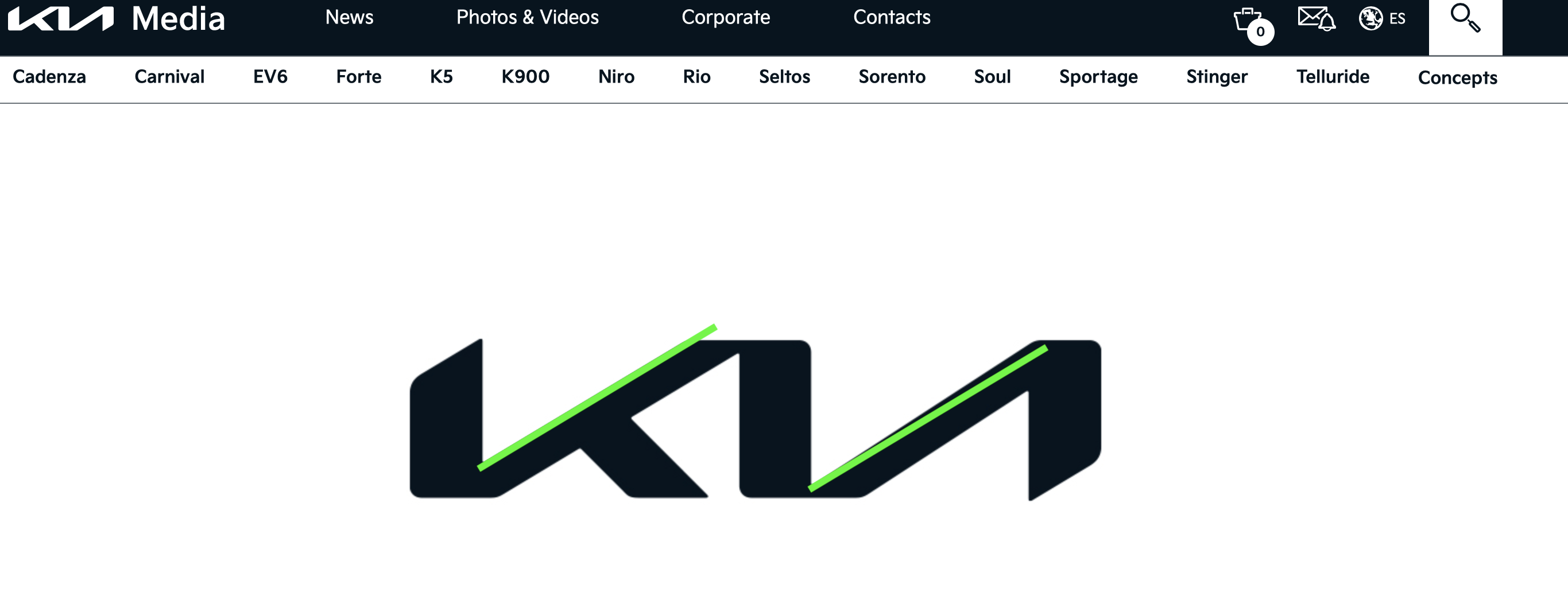
Symmetry. I give them a D-. The two sloped lines aren’t even parallel. This screen grab is directly from their website, I added the green lines to show the asymmetry.
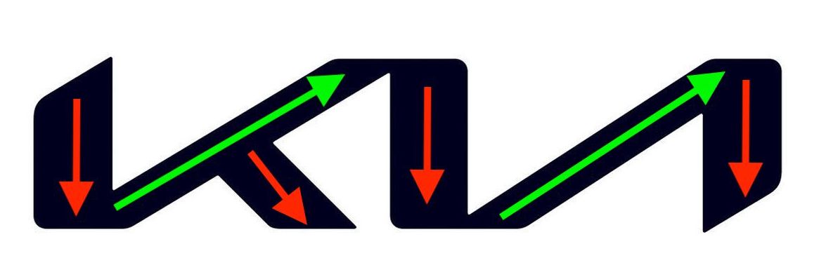
Rising. This is a D+. I see two lines moving upwards, and 4 moving down. That doesn’t quite add up to a positive experience.
Easy on the eyes? I give the visual appeal a C+. It’s just dang hard to read. I mean, I understand it’s a Korean brand, but this logo isn’t in their language, and it’s barely in ours! If you can’t tell yet, I’m not a fan. And it should be noted that I am a fan of Kia vehicles. The Telluride is probably my #1 favorite right now. Every time I see one, I almost stop and stare. However, lately I’ve been staring at the logo trying to figure out what the heck it is. For comparison, here is the original logo…

Sure, this original logo might be associated with cheap cars from their debut in the US, but I hardly believe that stigma would stick around since they’ve been producing a range of quality vehicles. Did I mention the Telluride yet? Love it.
Summary and Mini Rant. If it were up to me, I would’ve gone back to the drawing board to make the logo a bit easier to read from just a glance. As it is now, and I know it’s still very early in the logo transition so maybe it’s recognizability will grow, I can’t stand it! As you’re driving down the road, you hardly have time to see any logos while you scan the roadways. So when you do see one, it needs to be clean, simple, and most importantly (if it’s going to be text), easy to read!
How do you feel about the new logo versus the old? If you drive a KIA, please chime in with your thoughts on the vehicles themselves.
Thanks for stopping by!
-Out of the Wilderness
Discover more from Out of the Wilderness
Subscribe to get the latest posts sent to your email.
