Posting daily at 1pm central about all kinds of things. One day it's dating, the next it's TV commercials. I hope you're entertained. Professional photos on SmugMug – https://benwilder.smugmug.com
One of my favorite songs is called “Iko Iko,” as made popular by The Dixie Cups in the 1960s. I’m sure you’ve heard it in various covers over the years, but to help narrow down your favorite version (you’re welcome :)), here are my top 5 favorite recordings of this song…
The more people I meet, the more I love my dogs. I’ve heard this phrase over the years, and Carrie Underwood even has a song about it…
My most recent experience that makes me love my dogs more was at a bank. I was second in line to deposit some cash and there was only one teller. She began helping the gentleman in front of me so I checked my phone while I waited for them to finish. Little did I know the teller working the drive-through stepped over to a window to help me. All I heard as I became aware was the gentleman who was ahead of me say, “He’s on his phone…” followed by a snarky chuckle.
OK, that’s fine. We can let that slide. But as I’m talking to the woman about my deposit, I overhear him say to his teller, something like, “I know there’s a sign that says no cell phones in the lobby.” Really, guy? That’s how you’re going to be?
You will not even believe what happened next. As he and I are both waiting for our transactions to wrap up, his phone rings. He shows it to the tellers and myself as if he’s about to make an exception to his rule, “It’s my dad!” he says, and begins talking to his dad on the phone.
All I could do was laugh. Well, that’s not true, I definitely said something.
But really? Are most people a-holes, nowadays?
I’m going to hug my dogs now. Have a good one, folks!
An ad come on TV the other day and while I was being a busybody around my house, I could hear and recognize the voice. First, here’s the ad…
I really like this ad because it flashes back to a life I can relate to. Braces. Dial up internet. All such fun times, right? The woman in this ad is none other than Molly Lloyd! She is also in a current Zillow ad, as “Susan.” Check out that ad here. Invisalign gets a high grade for this one… presenting a problem and a solution in a fun and funny way.
As I was researching the Invisalign commercial, it brought up feelings of anxiety and annoyance because of an earlier advertisement for their product. This one, called “Hey Brandon,” has annoyed me since the first time I saw it.
What bothers me about this is…
1) If part of your company name is half of the word “invisible,” then how do Brandon’s friends even know he’s wearing teeth hardware at all?
2) I guess I’m turning into a grumpy man but I don’t like when kids act like they’re the s%#t. Know what I mean? This kid is a little too cocky.
3) Broadly speaking, can you imagine the germs and the overall grossness of the clear aligners? Yuck, yuck, yuck.
How do you feel about these two Invisalign ads? Am I overthinking the “Hey Brandon” commercial? Do you enjoy one more than the other? Chime in below and thanks for stopping by!
The popular show from the late 1980s is making a comeback, this remake featuring a cast of mostly black characters, including Dulé Hill (who played a favorite character from one of my favorite shows – Psych)! In this reboot, he plays the role of father to the main character. In the 80s sitcom, the protagonist, if you will, was played by Fred Savage. Fred’s character, Kevin, had a dad that really scared me! I remember that, even though I was only about 10 yrs old when the show debuted.
Here’s a teaser for the 2021 season…
I can only be honest here on this blog, so I have serious doubts about this show’s success. It may be great, but it will always be compared to the original – which must be considered by most, a classic. I tend to lean towards the idea of leaving those alone… however, I understand Hollywood takes no such stance. This will also take place in the 1960s, as did the original, so that in itself might polarize viewers in 2021. I can say this with almost 100% certainty: if there is a political vibe to the show, it will come crashing down. And let’s be honest- it’s Hollywood, so you KNOW they’ll try sneaking some BS in there somewhere.
I wish all the best to the cast and crew, though. We all gotta work, ya know? I’m interested if I can separate Dulé Hill from his awesome character in Psych – a hard task for him, since that’s an iconic role in the show beloved by many.
How do you feel about this show being recreated for a new audience in 2021? Do you think it will soar as a runaway hit? Comment below with your thoughts…
If you’ve noticed KIA’s new TV ads lately, or seen their vehicles around town you might have picked up on their new logo. Yes, it’s that one you can’t quite figure out.
Apparently the brand has stated that the new logo embodies “symmetry,” “rhythm” and “rising.”
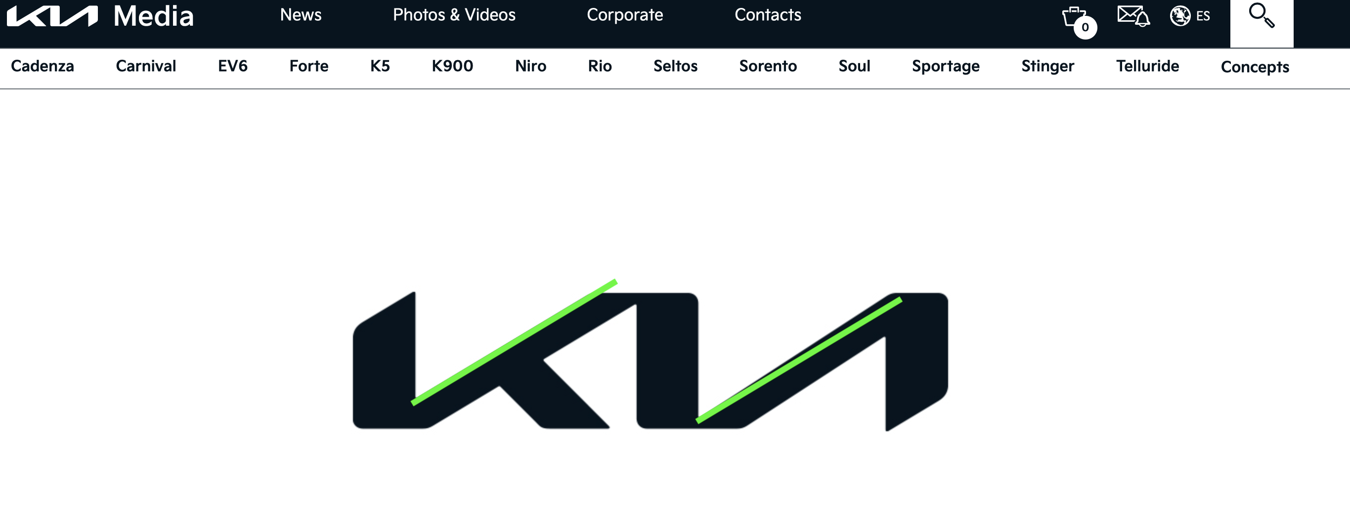
Symmetry. I give them a D-. The two sloped lines aren’t even parallel. This screen grab is directly from their website, I added the green lines to show the asymmetry.
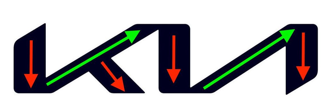
Rising. This is a D+. I see two lines moving upwards, and 4 moving down. That doesn’t quite add up to a positive experience.
Easy on the eyes? I give the visual appeal a C+. It’s just dang hard to read. I mean, I understand it’s a Korean brand, but this logo isn’t in their language, and it’s barely in ours! If you can’t tell yet, I’m not a fan. And it should be noted that I am a fan of Kia vehicles. The Telluride is probably my #1 favorite right now. Every time I see one, I almost stop and stare. However, lately I’ve been staring at the logo trying to figure out what the heck it is. For comparison, here is the original logo…
Sure, this original logo might be associated with cheap cars from their debut in the US, but I hardly believe that stigma would stick around since they’ve been producing a range of quality vehicles. Did I mention the Telluride yet? Love it.
Summary and Mini Rant. If it were up to me, I would’ve gone back to the drawing board to make the logo a bit easier to read from just a glance. As it is now, and I know it’s still very early in the logo transition so maybe it’s recognizability will grow, I can’t stand it! As you’re driving down the road, you hardly have time to see any logos while you scan the roadways. So when you do see one, it needs to be clean, simple, and most importantly (if it’s going to be text), easy to read!
How do you feel about the new logo versus the old? If you drive a KIA, please chime in with your thoughts on the vehicles themselves.